
My favorite game is trending yay. Colorfinding is the best. As a branding and editorial photographer based in San Diego, I often think about color as more than aesthetics. The palettes we return to shape visual identity, emotional atmosphere, and the way a brand or photograph lives in memory.
Color Finding: How Photographers Build Visual Worlds Through Repetition
If you are a photographer long enough, eventually, certain colors begin following you. You notice them entering photographs before you consciously frame them. They appear in different countries, different seasons, and different bodies of work. They move through cities ahead of you like a fortune teller. Wanderlings the Zine taught me so much about what I like to collect. Years ago, I thought I was photographing places but now I think I was photographing and collecting color relationships.
I collected fragmented thoughts, and stream of consciousness ideas all told through images of:
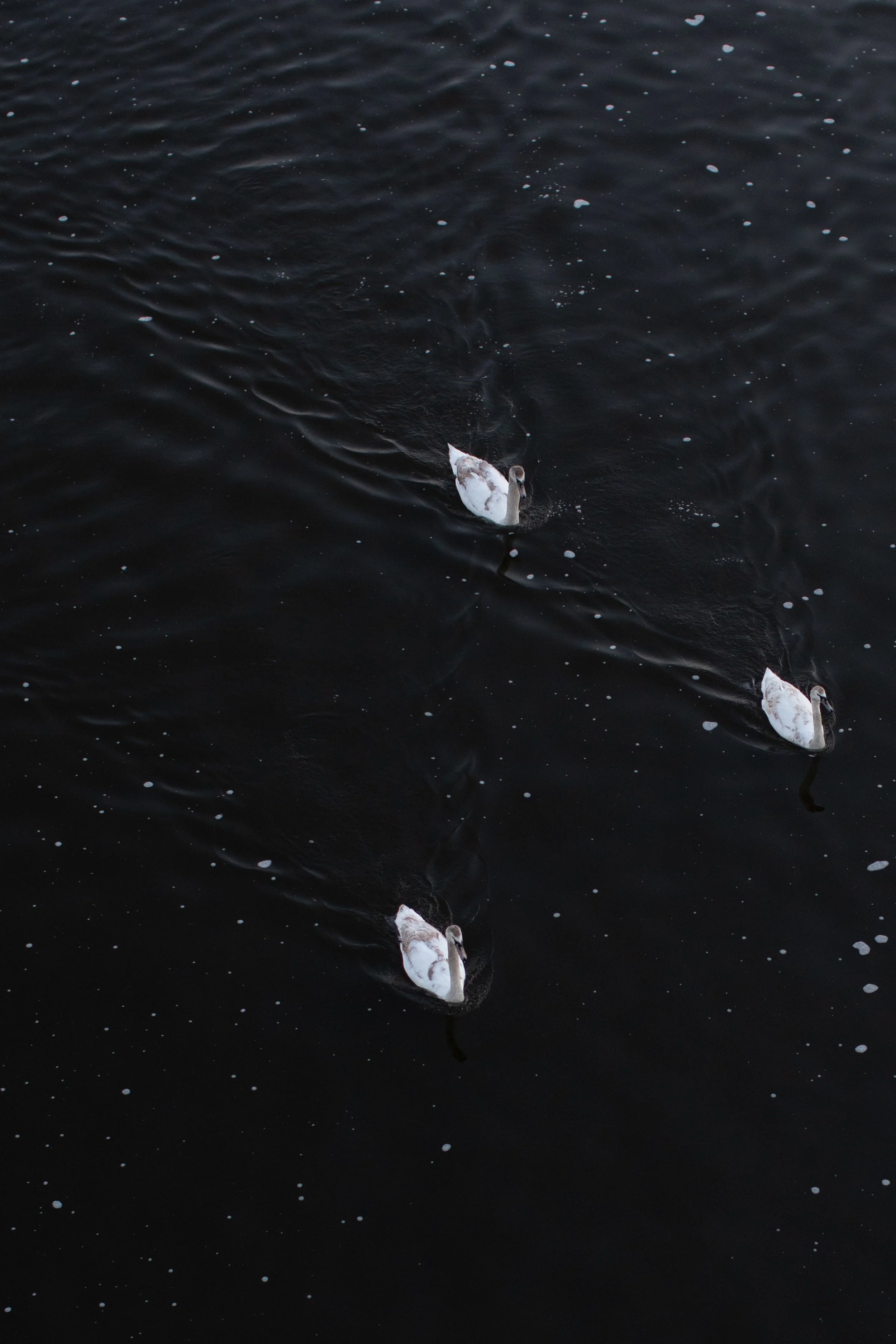
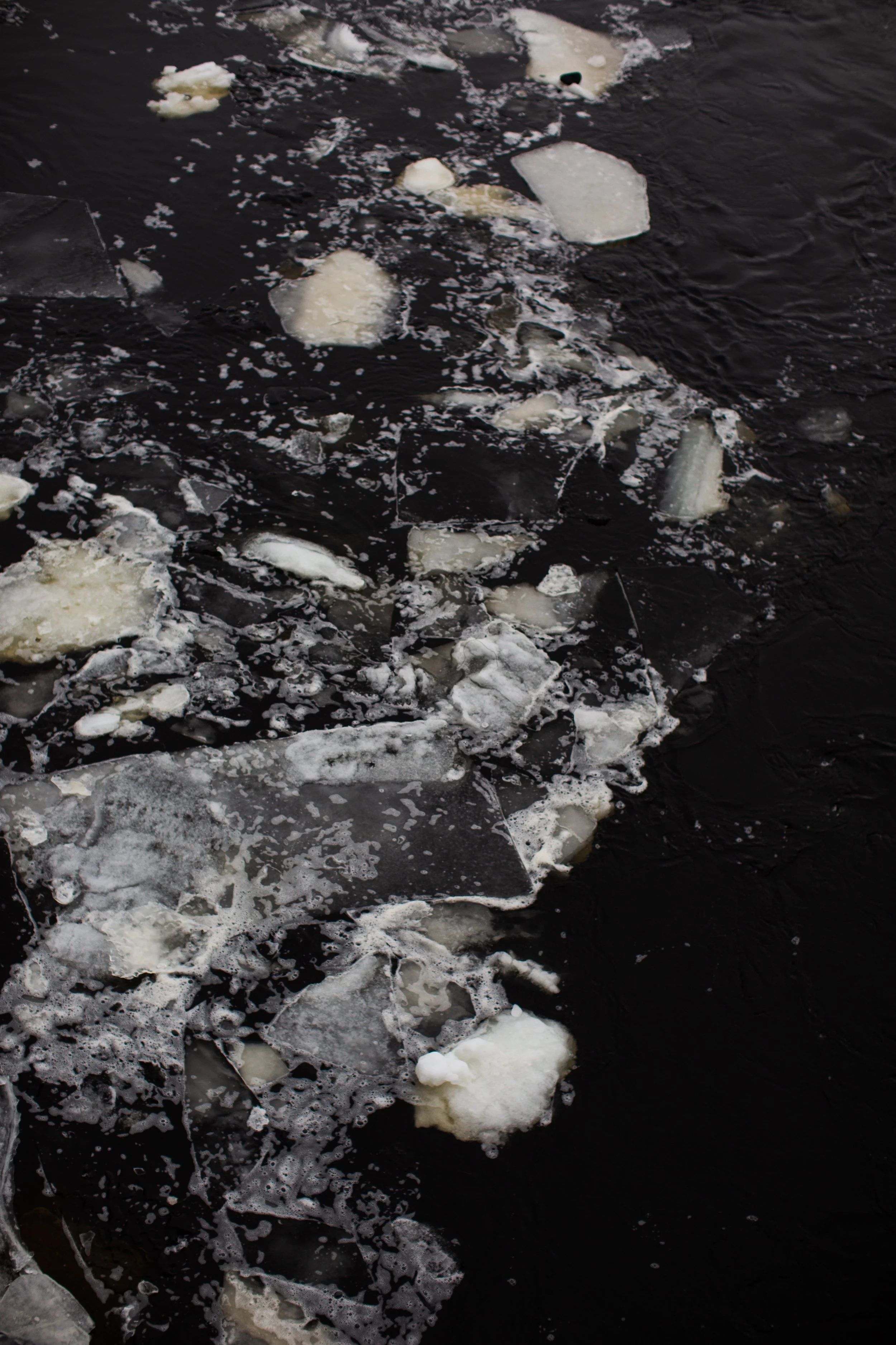
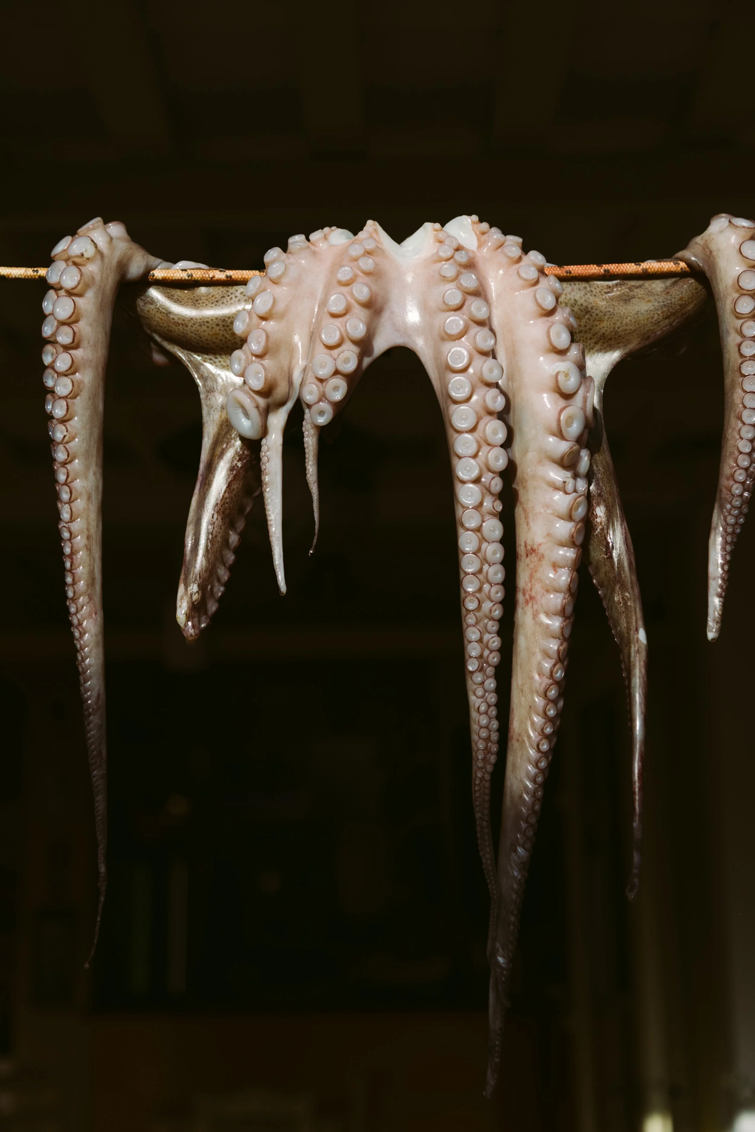
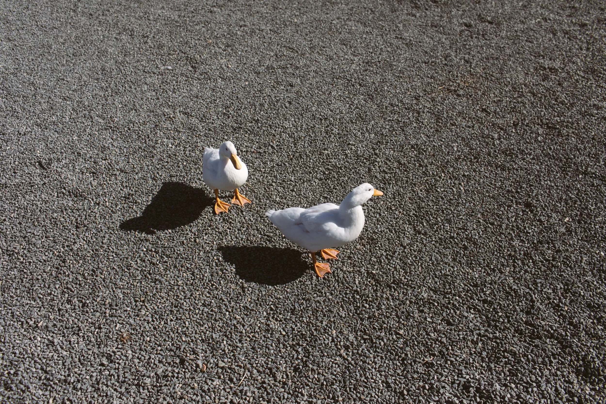
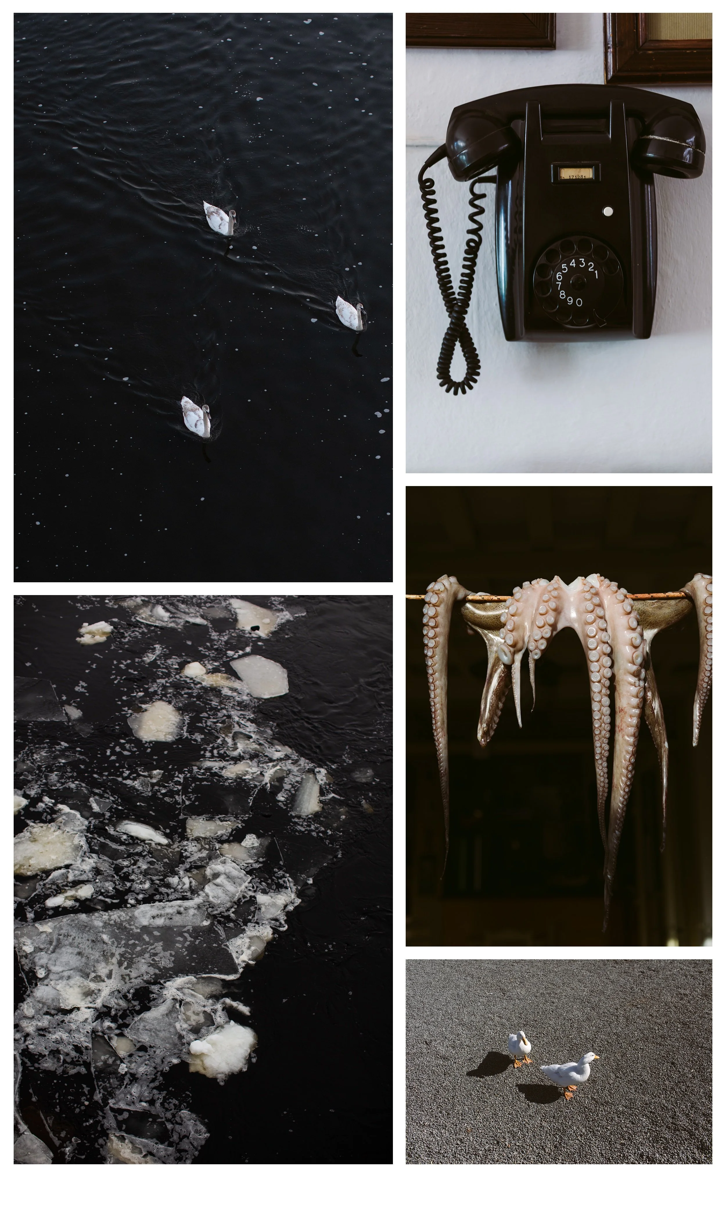
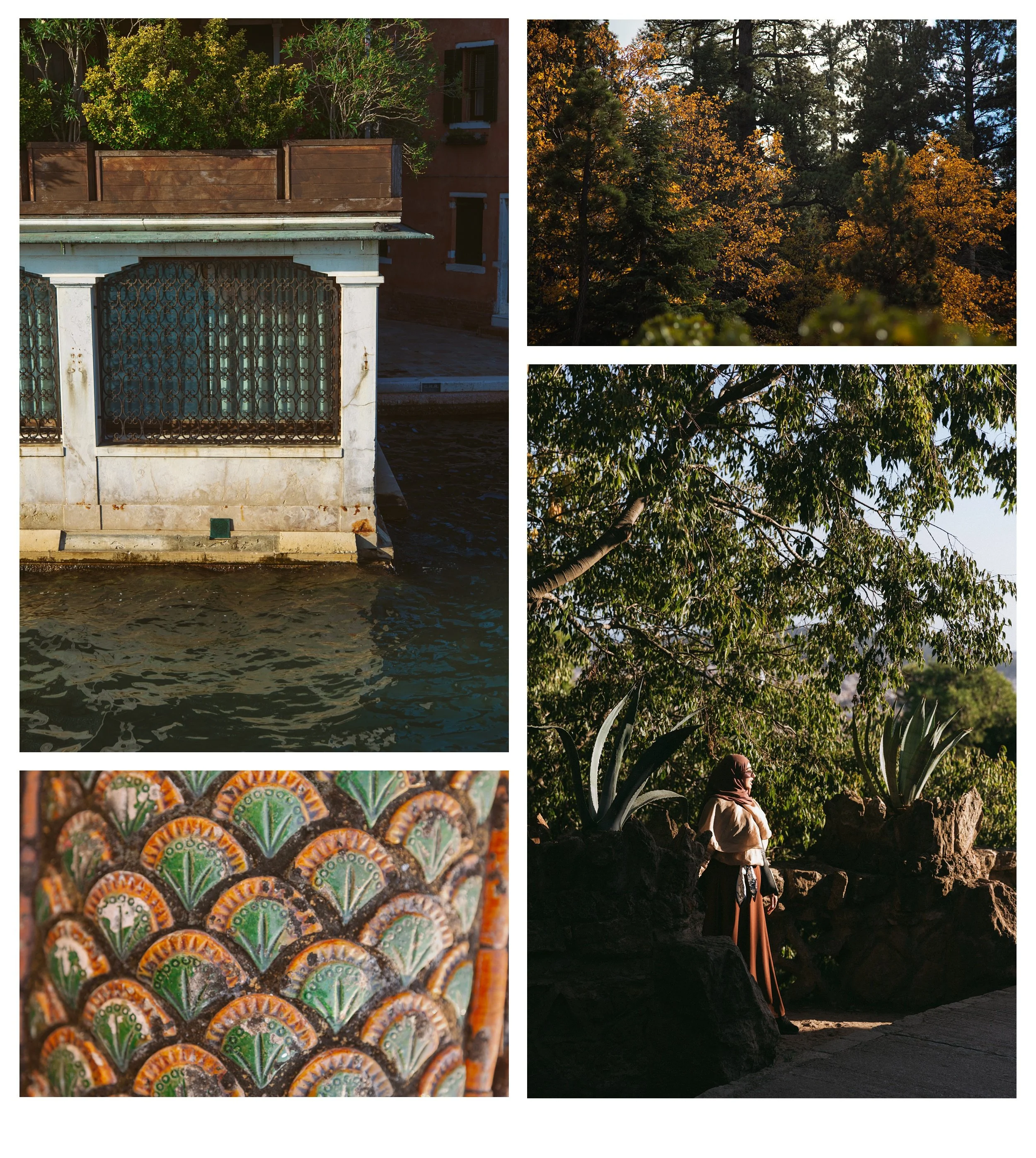
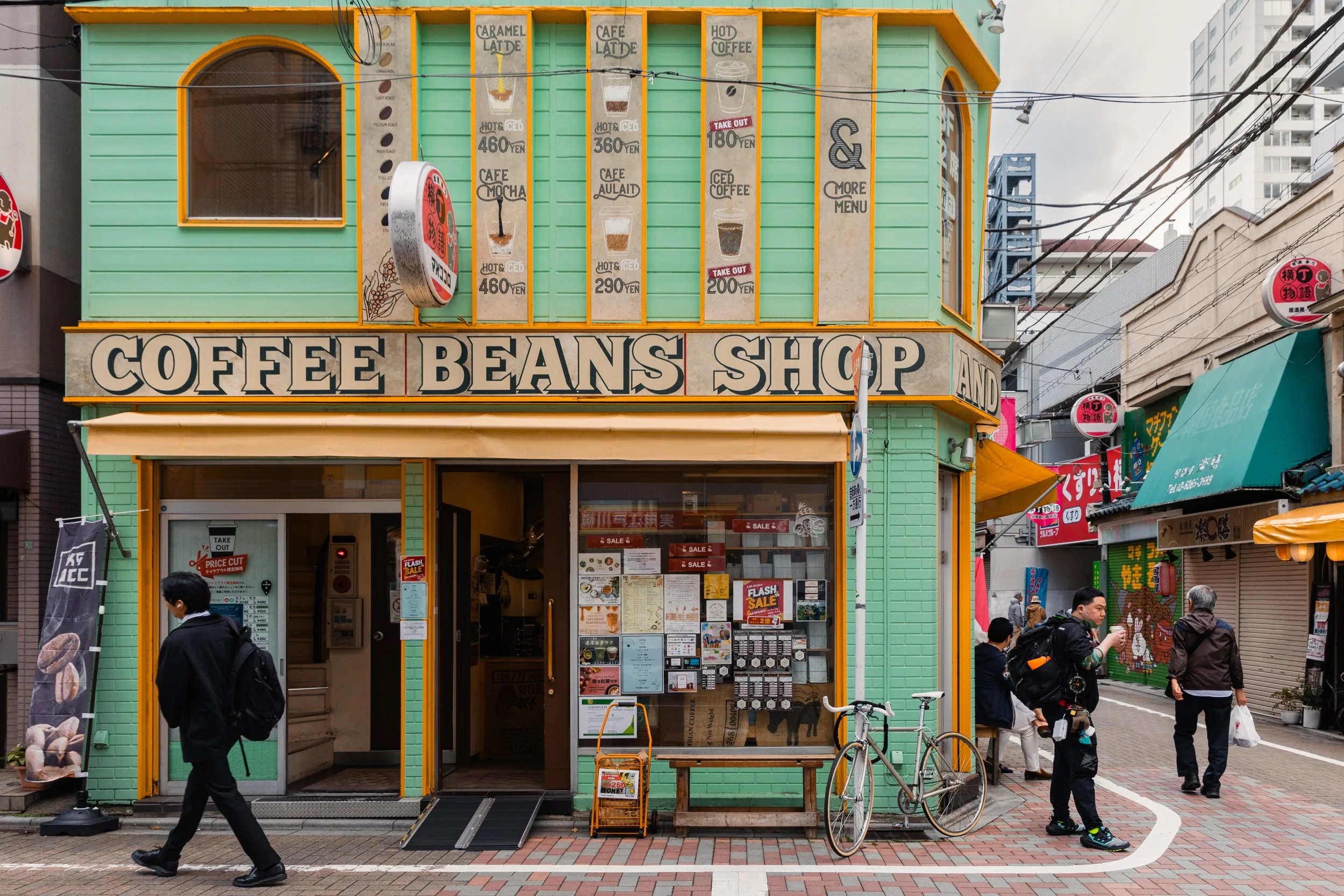
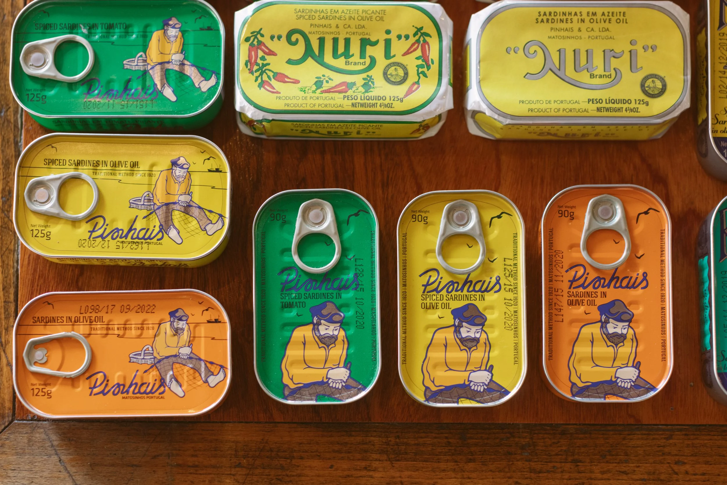
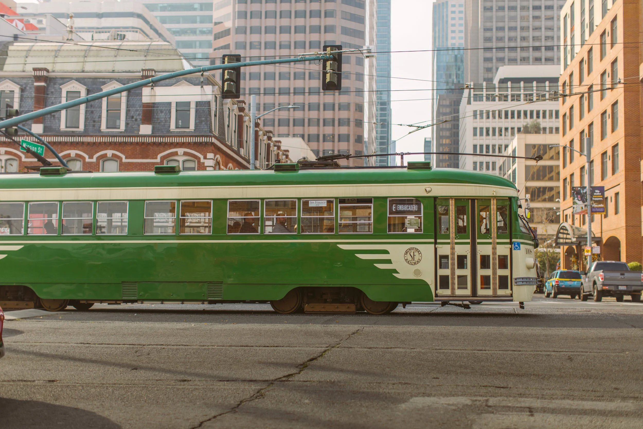
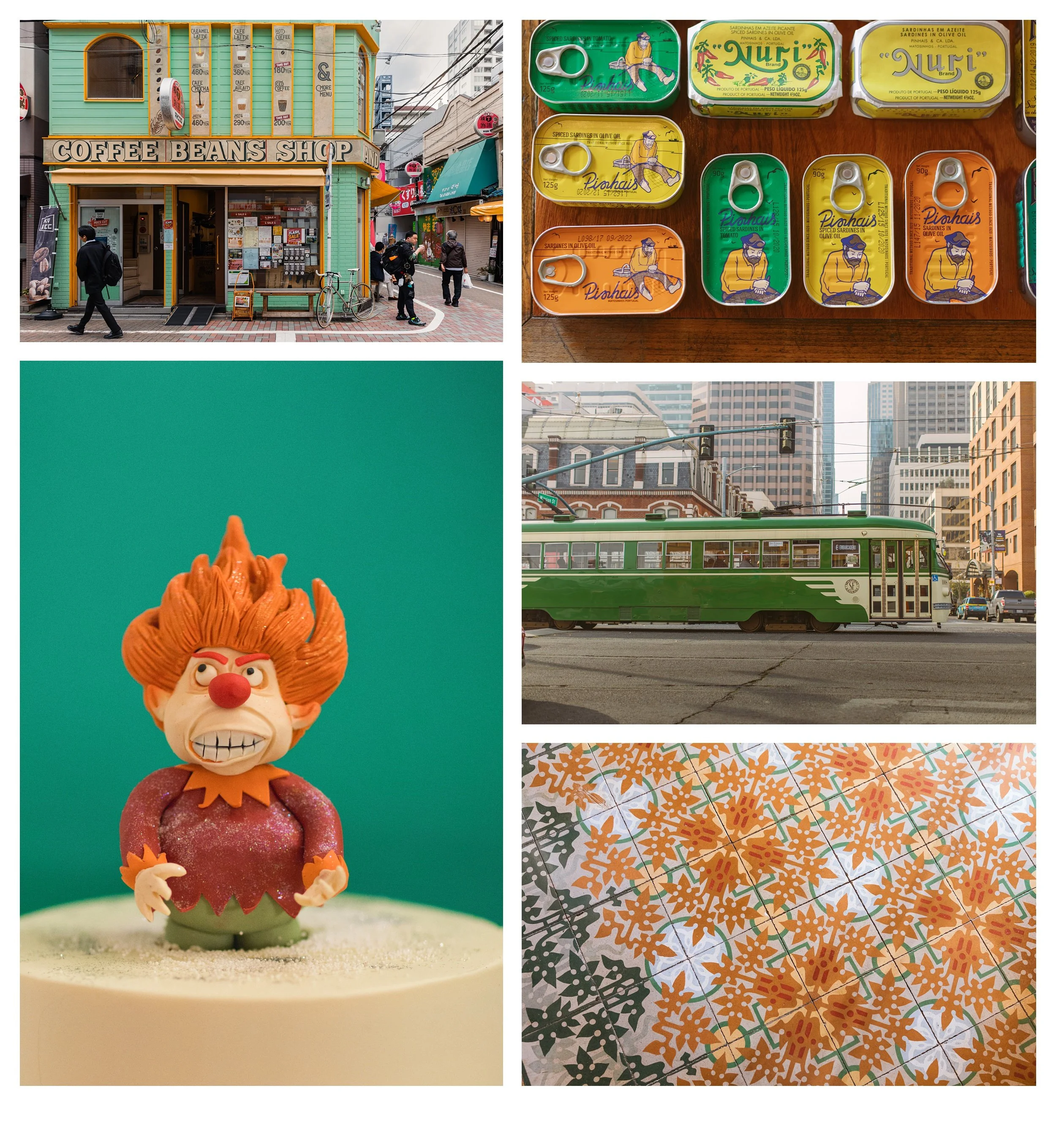
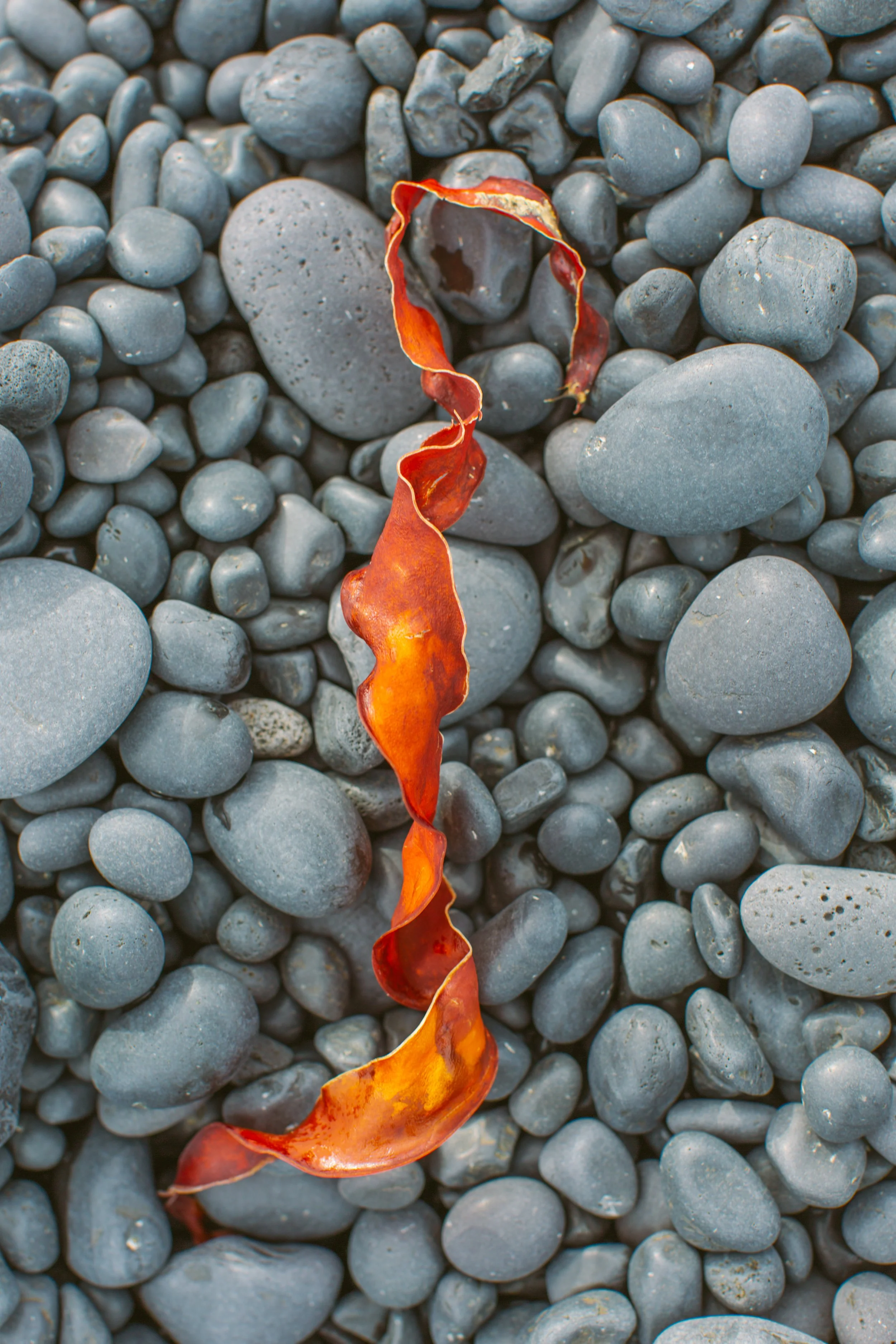
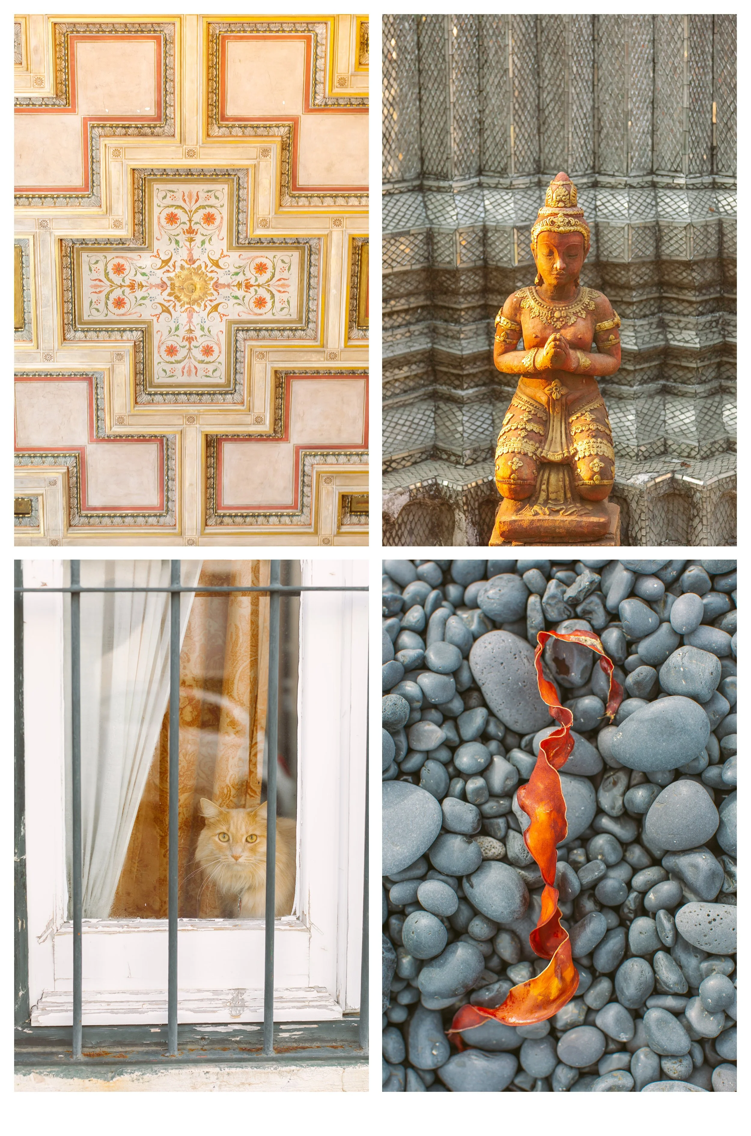
A faded mint storefront in Japan with mustard-orange trim. Sardine tins in Lisbon arranged in impossible greens and yellows. An unexpected octopus hanging like a sculpture against dark wood in Paros, Greece. Orange kelp ribbon tangled against cold grey beach stones on our van trip around Iceland. A vintage green tram moving through soft San Francisco fog just like when I was in art school. Black water interrupted by white ducks drifting like punctuation marks.
At first these felt unrelated. Travel fragments. But over time, repetition creates meaning. Not just in color of course but mood, season, vibe. Maybe soon the color finding game will evolve into more categories. A photographer can dream can’t she? The strange thing about developing a visual style as a photographer. Often, it begins long before you understand what you’re making.
Beginning in Black and White
I think many photographers begin in black and white emotionally, even if they technically shoot in color.
You start by noticing shape. Contrast. Gesture. Weight. The emotional pressure of light. For me this was true albeit against my will. The first few years of my photography classes were black and white classes. It took so many years before I was advanced enough to take color classes. I learned so much by the restriction of grey scale although I can assure you I was so ready to learn color.
For years, I was drawn toward shadow and contrast. Dark water. Architectural lines. Winter trees. Negative space. Human figures isolated against pale walls.
Black and white teaches restraint. It teaches structure. It teaches you how to see before color seduces you.
All of my teenage angst and frustration with only seeing greyscale led to some images that were more isolated. And for me the transition to color film was an instant love affair. I felt the excitement of kissing a cute boy. I was obsessed with murals and wardrobe and pushing the film as far as I could take it. The warmth of the sun appeared and I was seduced. At first I was in love with every version of color and I could not contain my enthusiasm. Eventually I develop so much restraint and find my way to more and more subtle color finding.
This series starts with color images that are predominantly black and white and then moves through some color combinations. As a photographer who still remembers all those years of only capturing images in black and white (Ilford FP4) I always finding it thrilling when I come across a scene that is primarily stripped of color.
Notice how it slowly warmed and warmed and green found its way in.
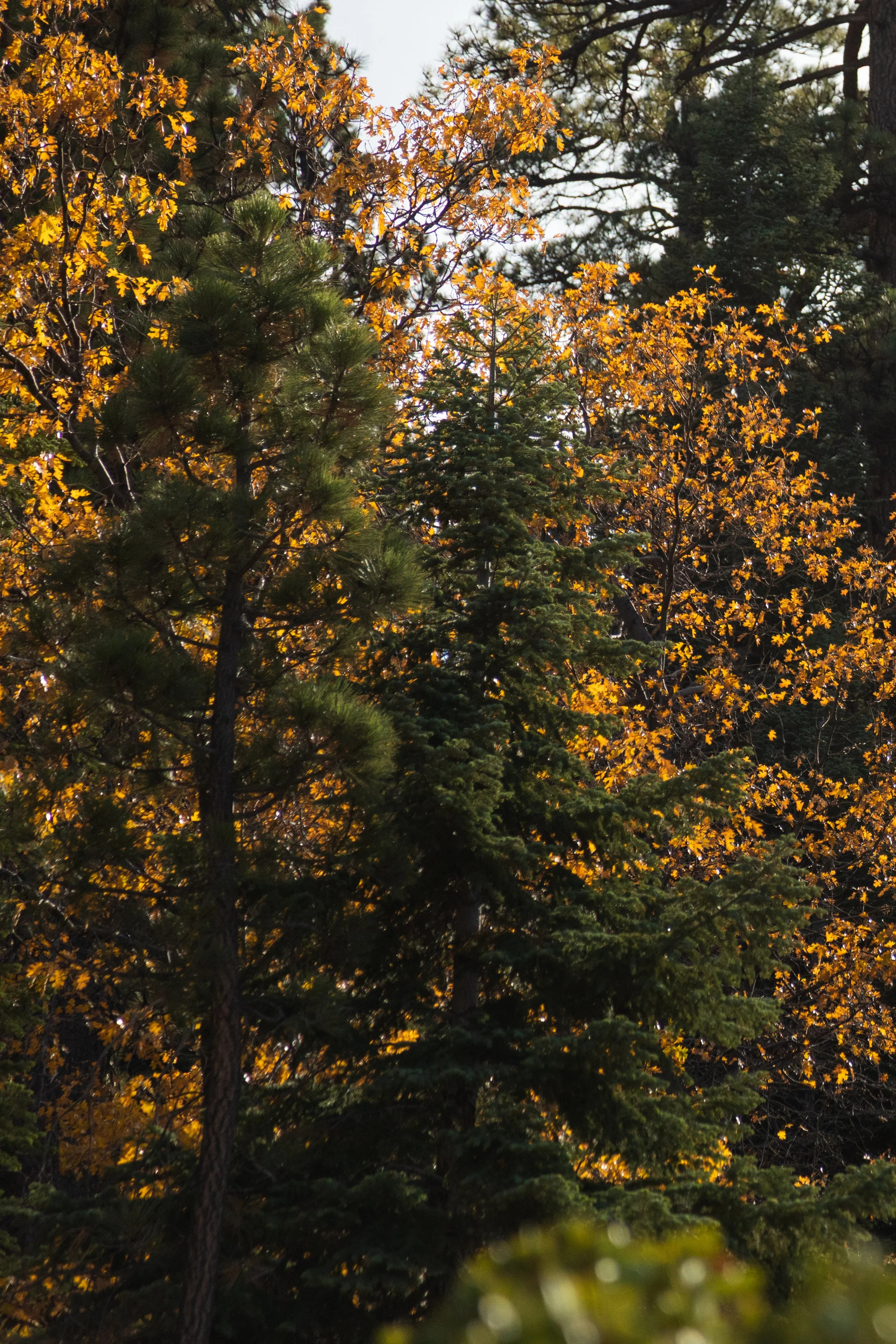
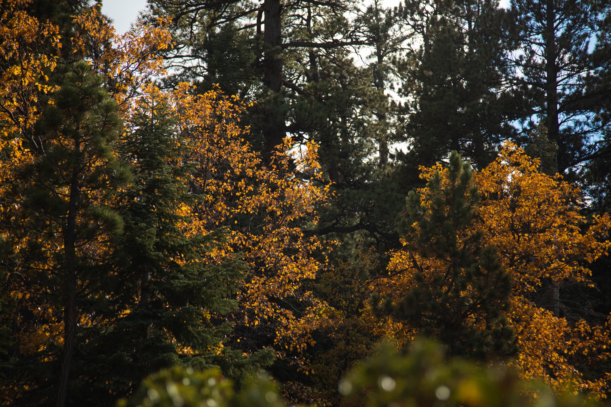
Orange and Green
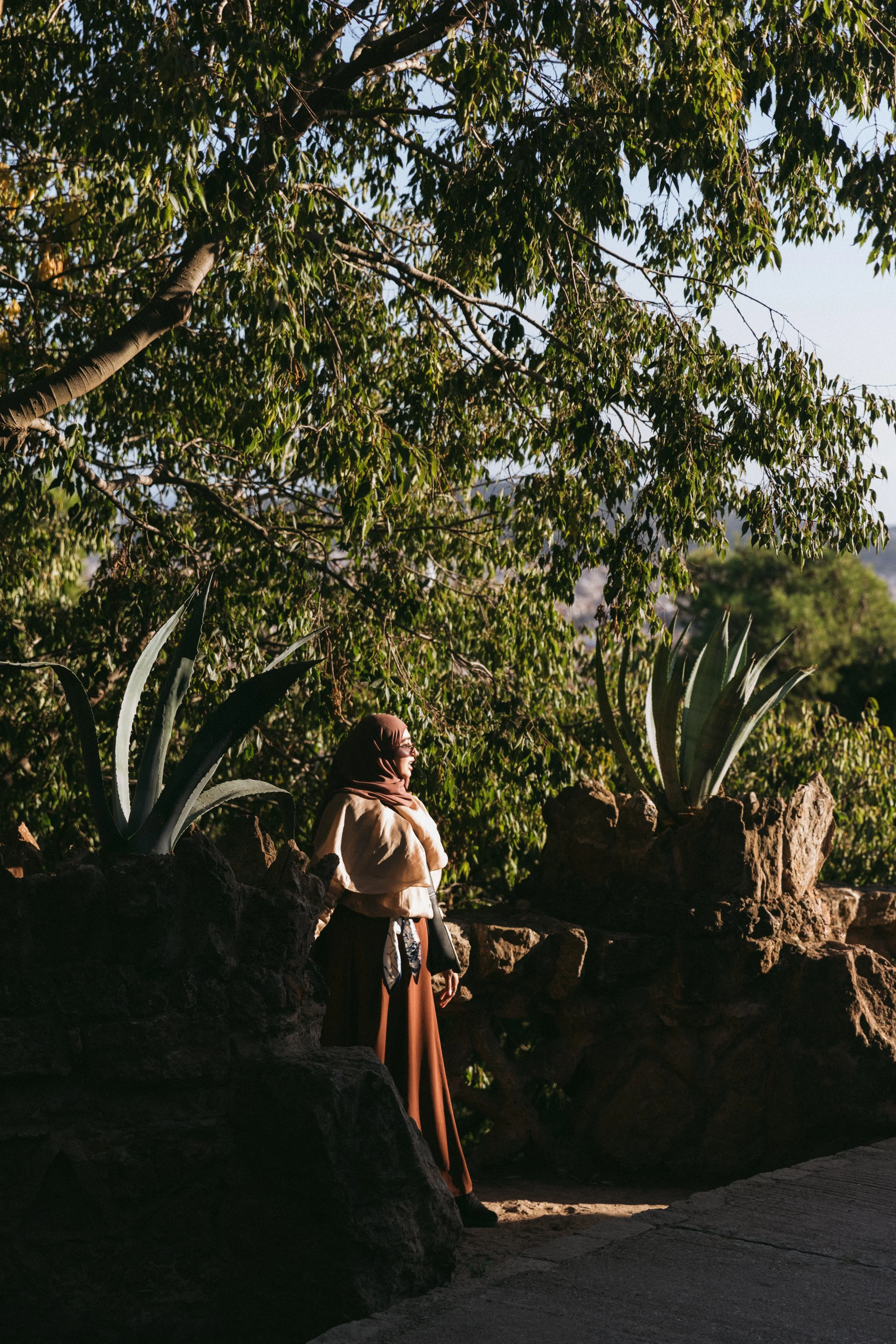
I tend to love warm and cool colors together. Much like my hero Baz Luhrman. Usually it’s more to do with shades of red, yellow, and blue. But my friend the talented Vanessa Luna told me her favorite colors are orange, green and purple. Falling in love with these colors was like an extension of our friendship. Initially they weren’t my favorite colors but we traveled together so often and her way of seeing beauty seeped into me. What a gift.
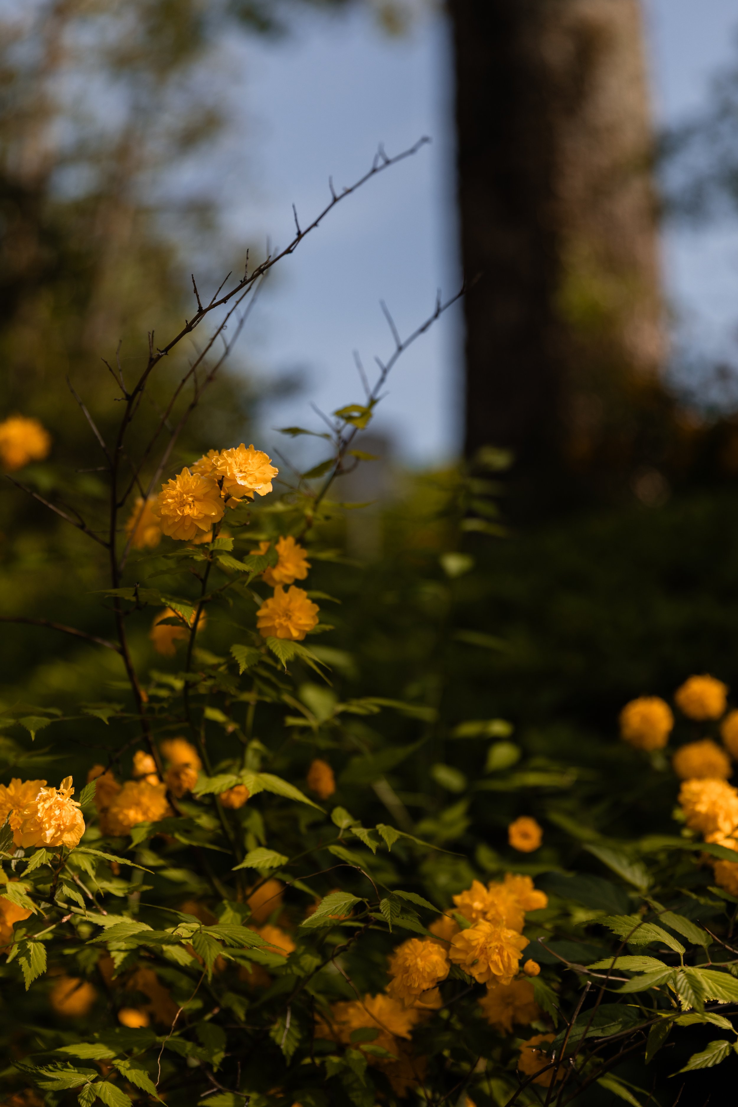
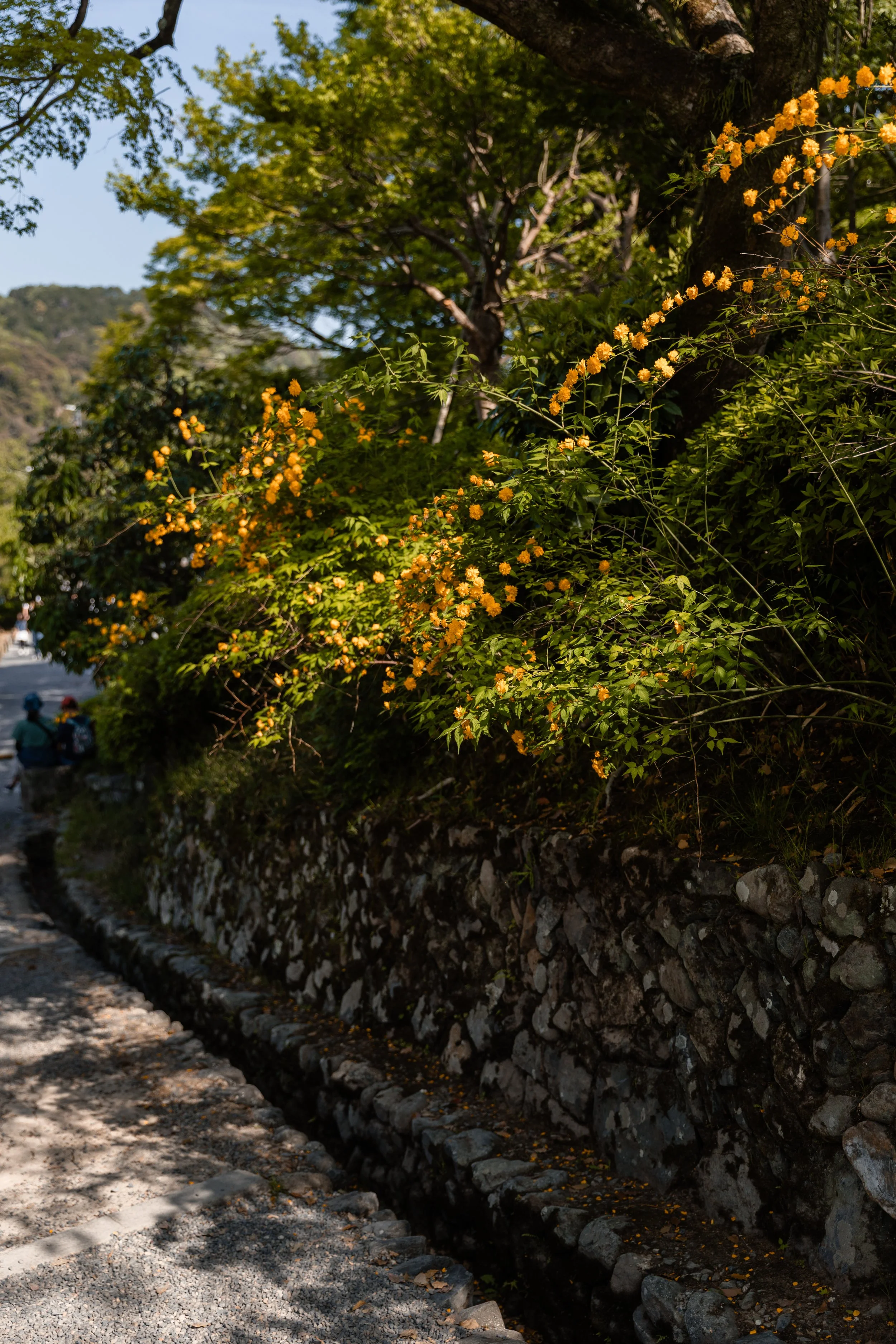
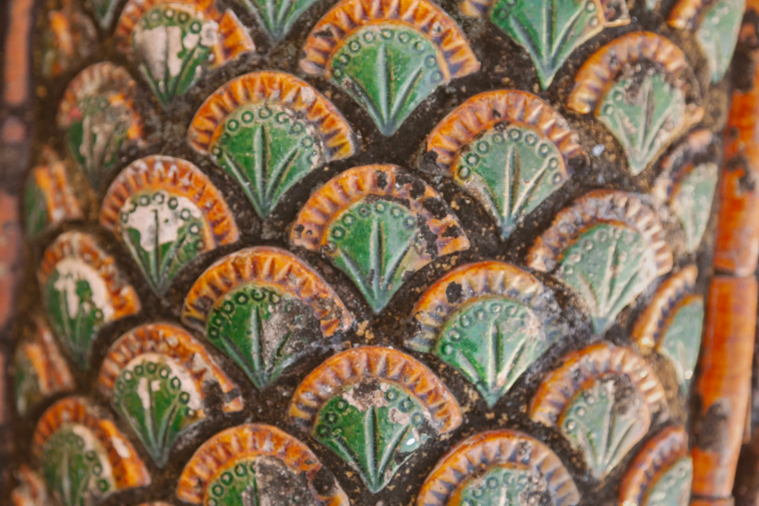
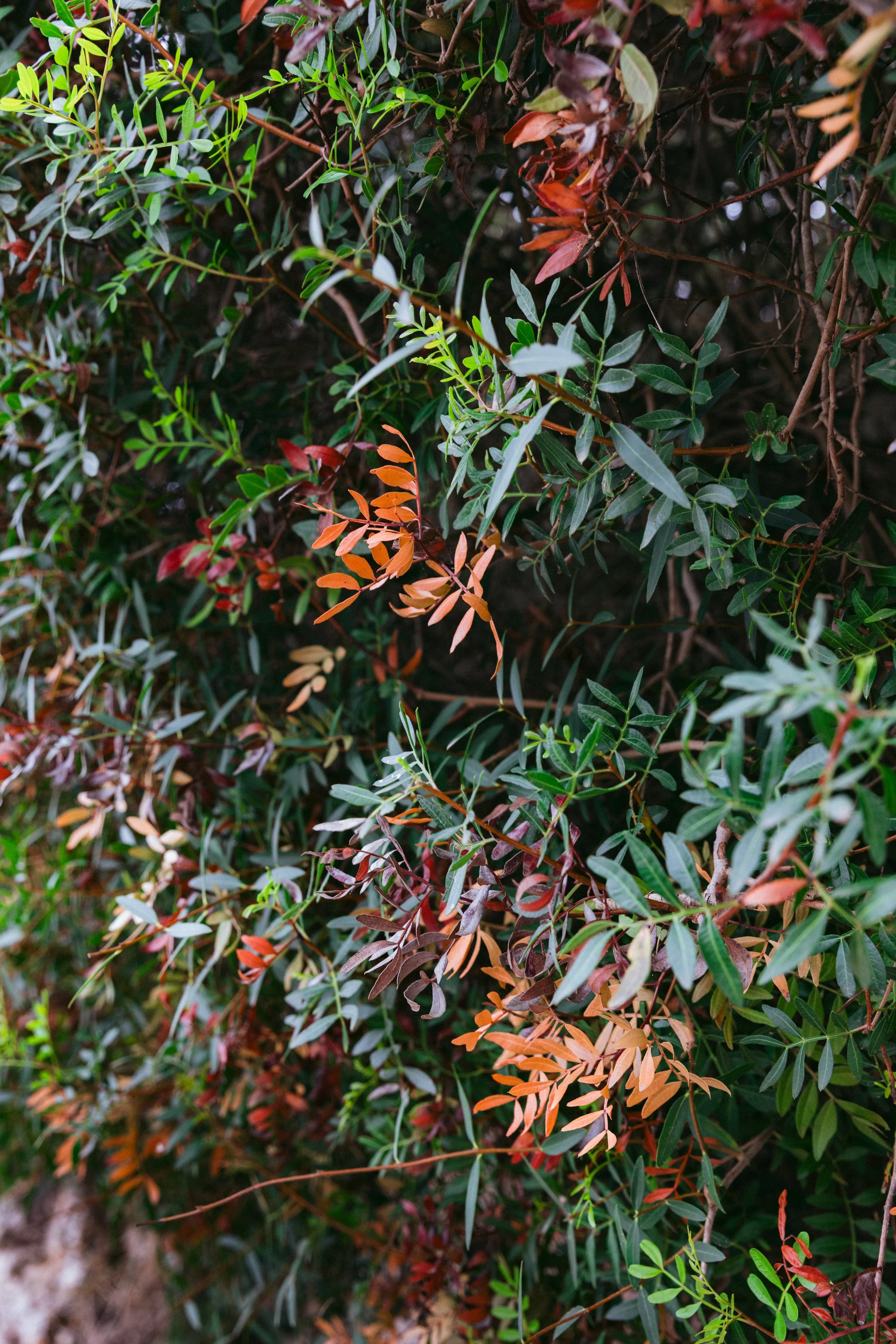
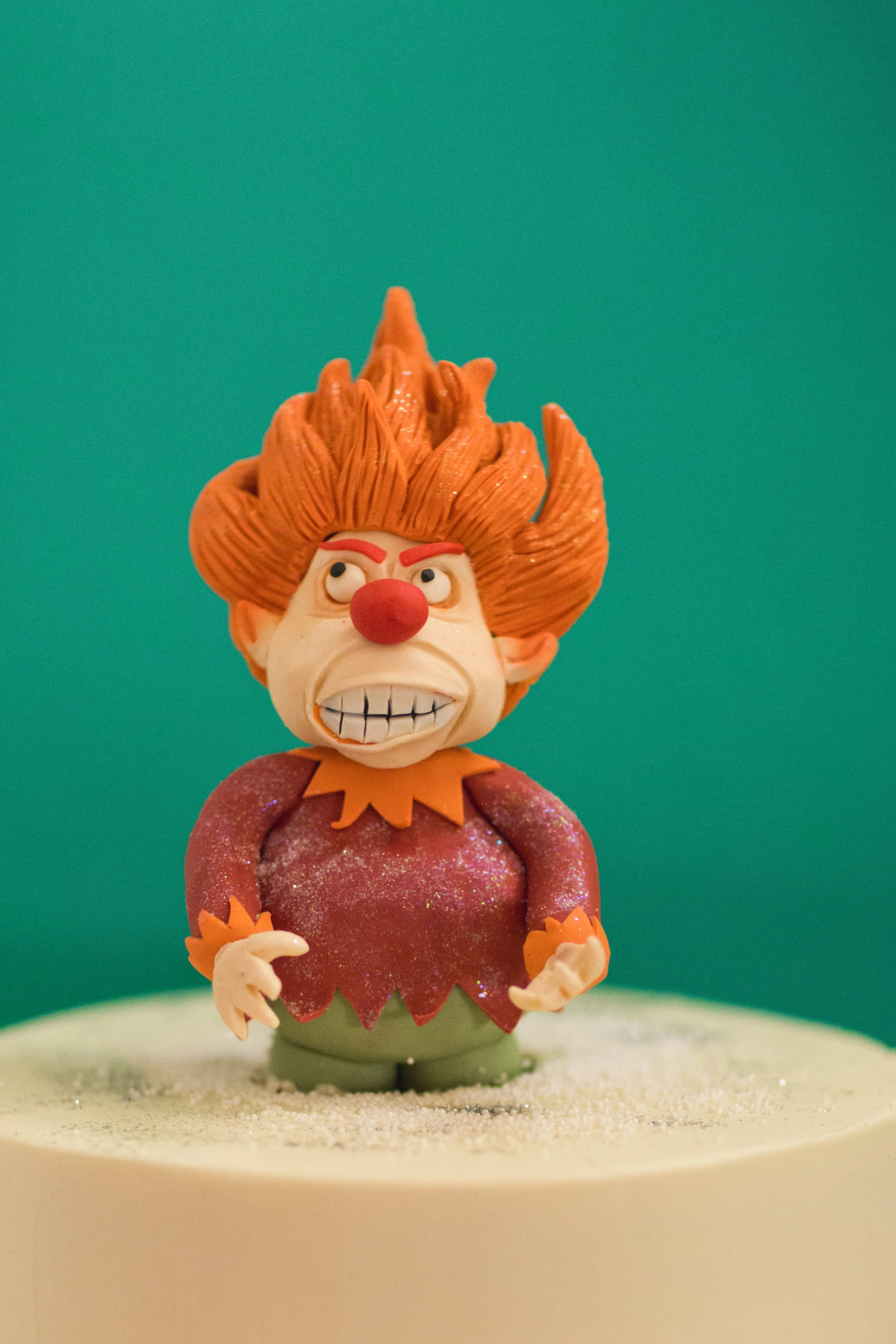
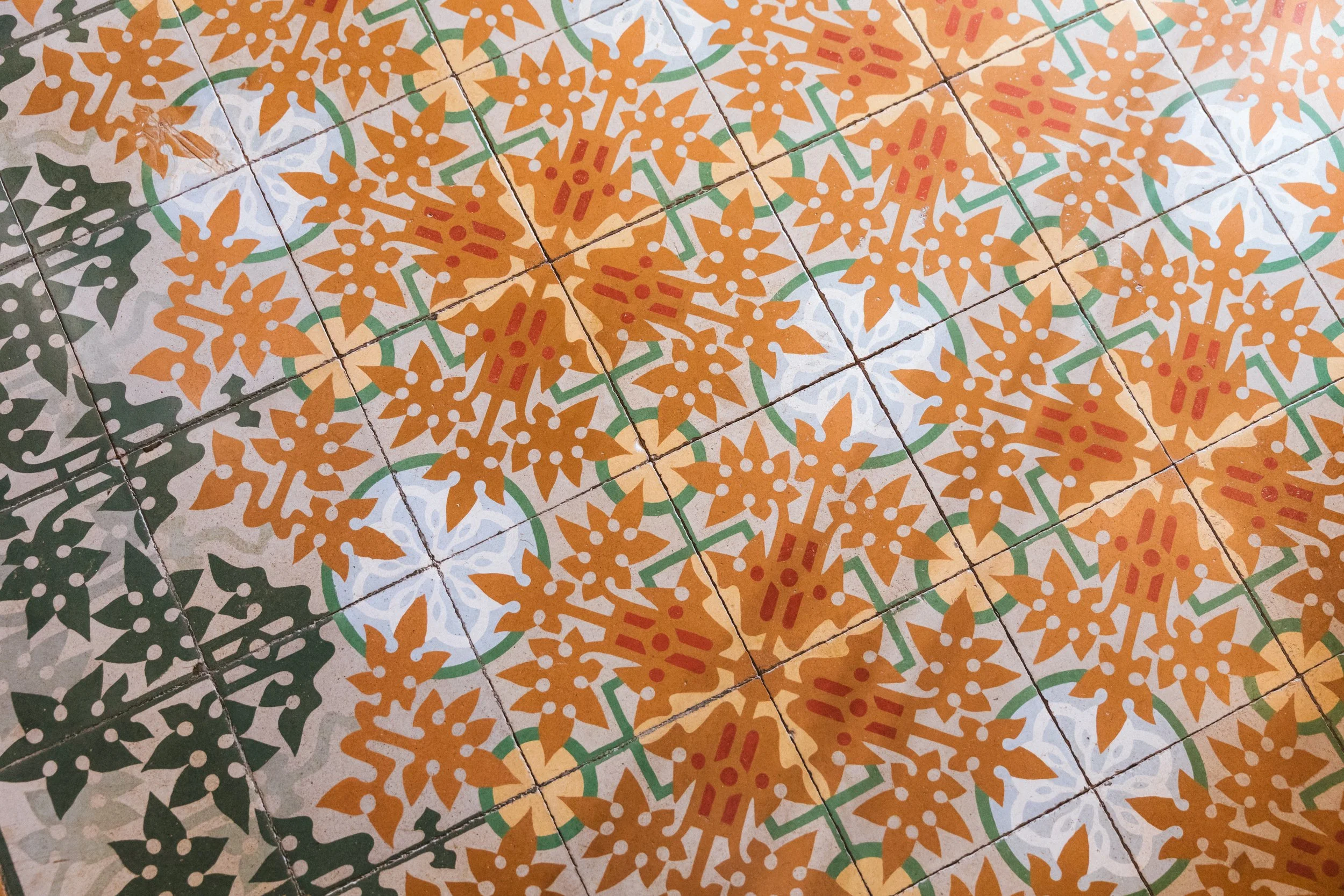
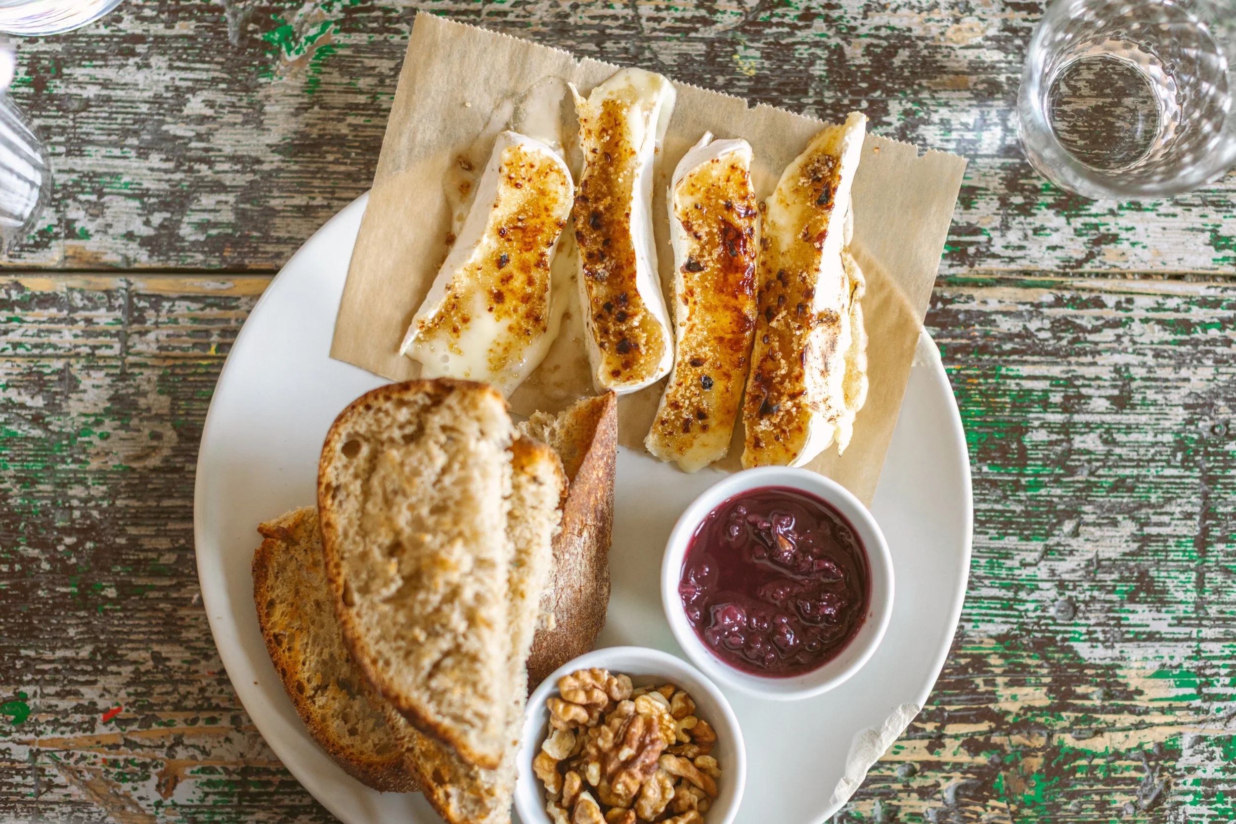
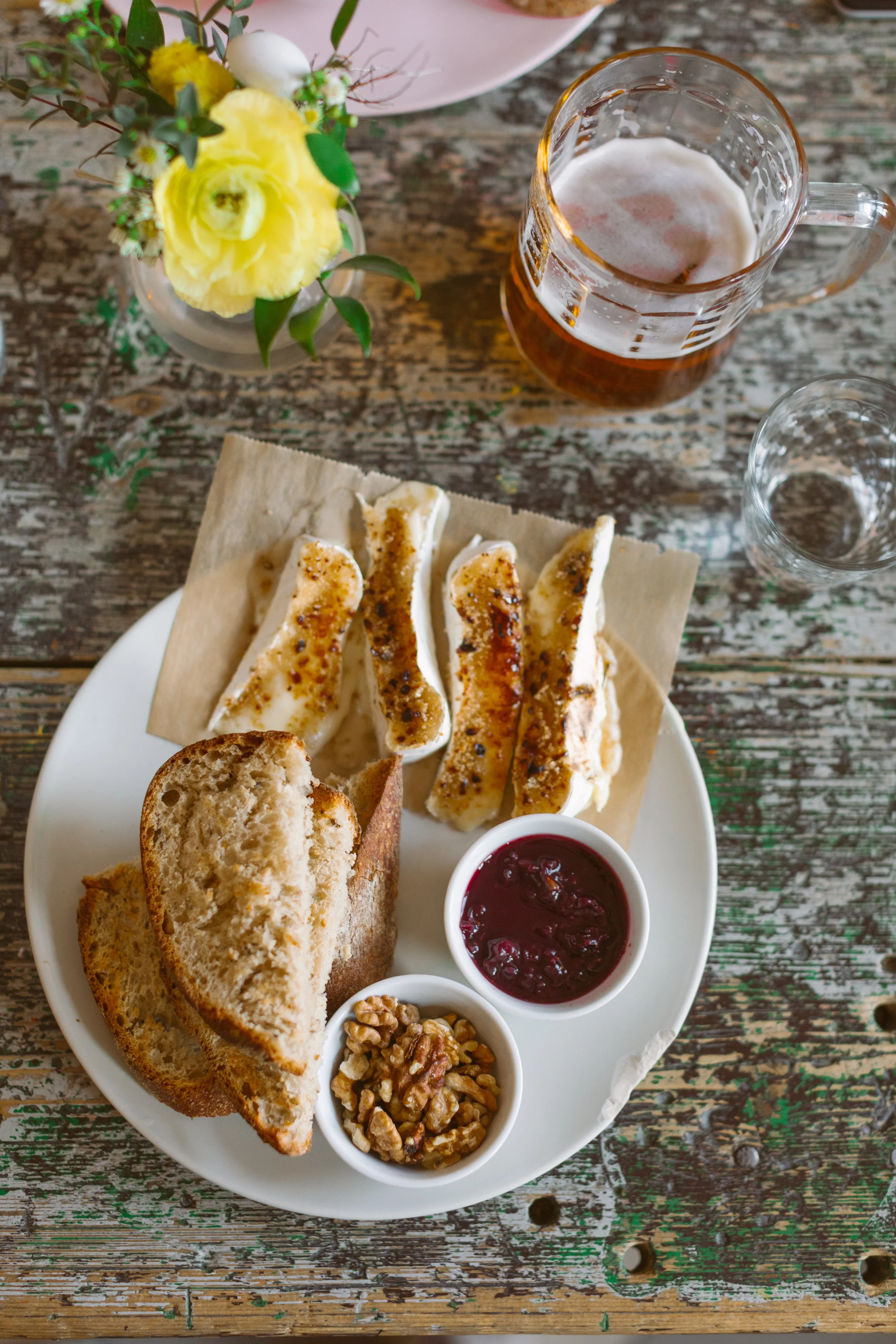
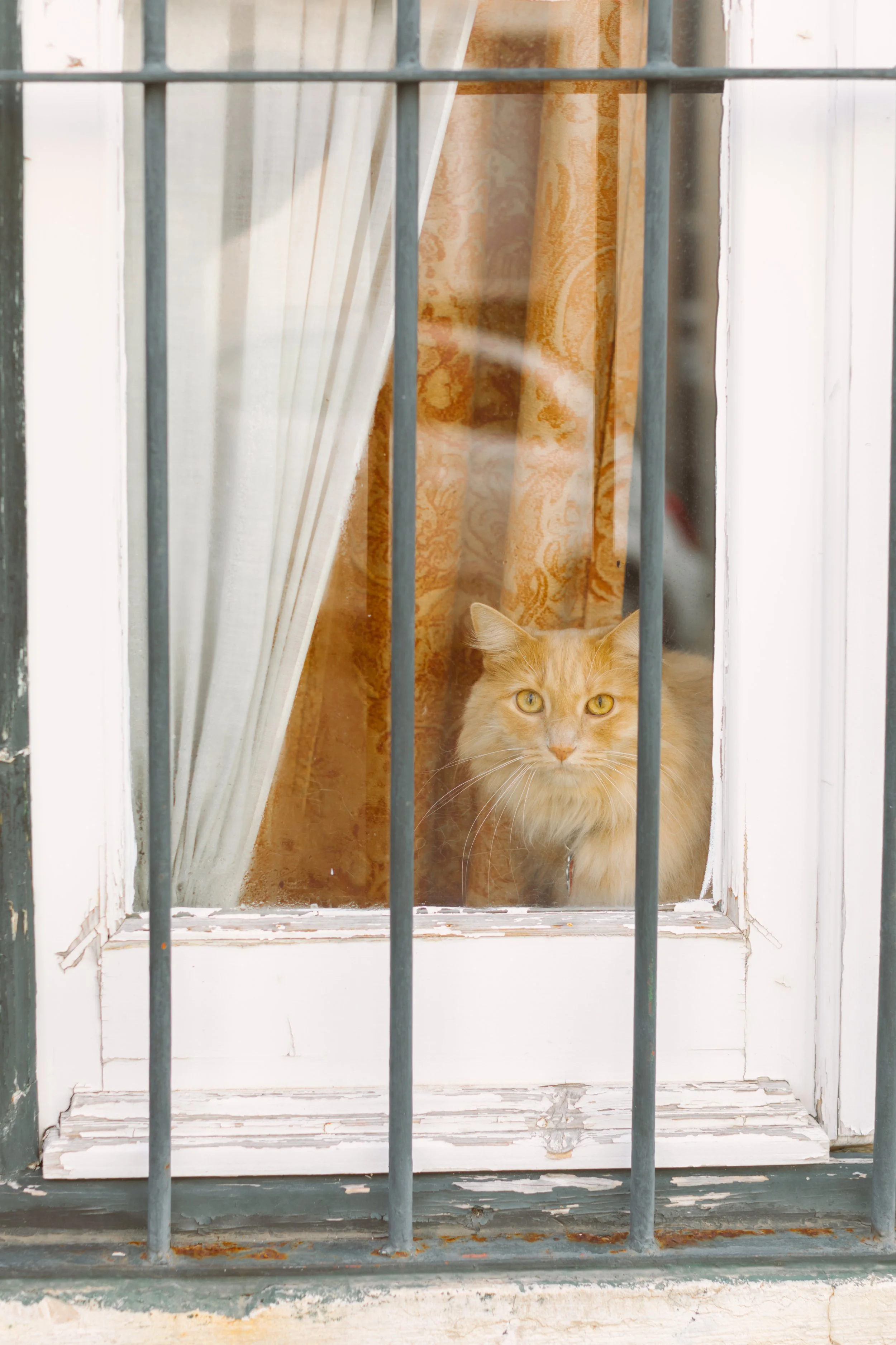
There was a period where I could not stop seeing orange and green together. Not clean graphic-design green. Not holiday green. More complicated greens. Oxidized green. Seaweed green. Tram green. Matcha green. Faded tile green. Artificial mint against polluted city light. And always interrupted by warmth.
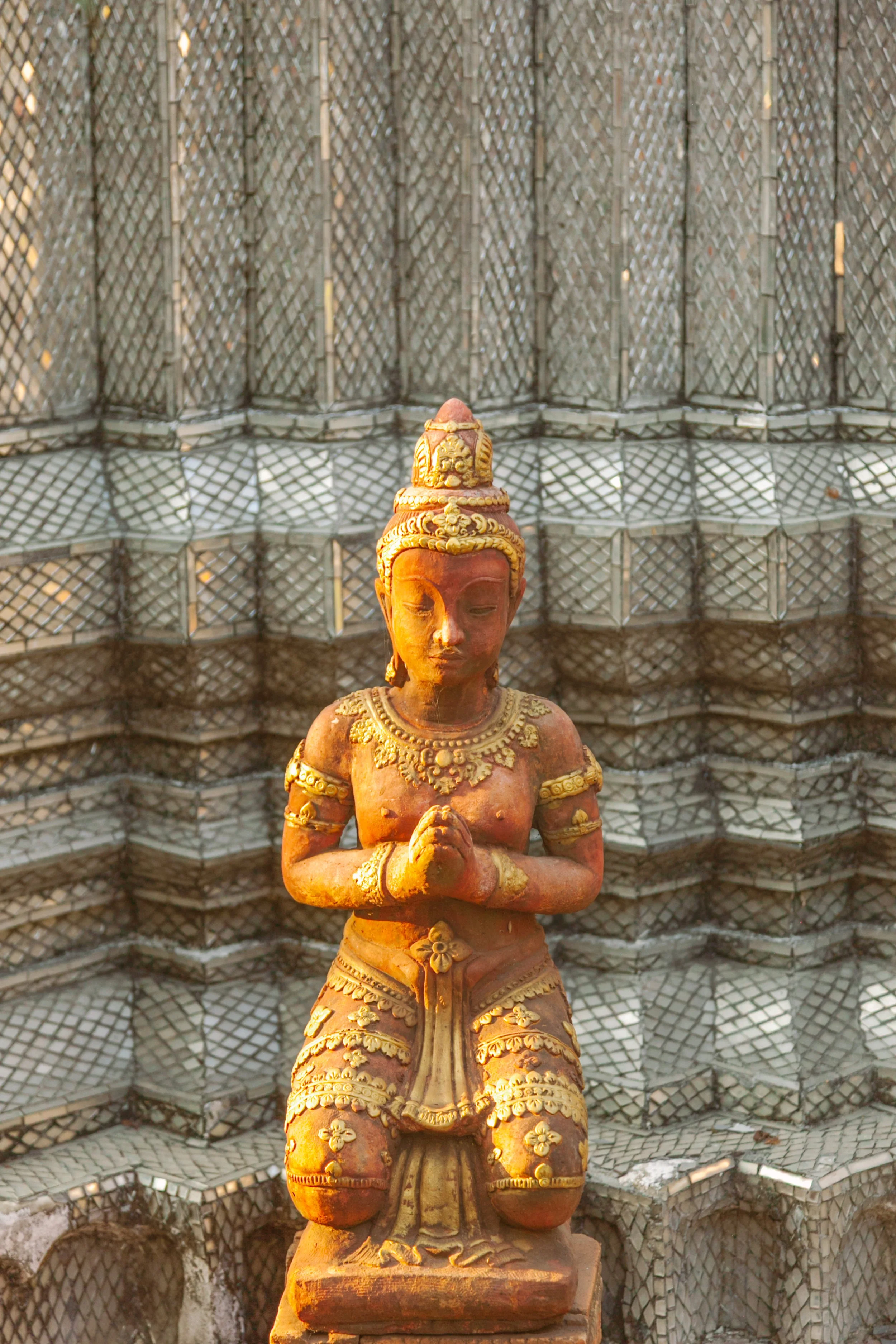
Orange signage in Tokyo. Portuguese sardine tins. Temple gold drifting toward amber. Persimmon-colored kelp against stone. Sodium-orange reflections moving through wet pavement. The combination started feeling less like aesthetics and more like emotional geography.
Orange and green hold tension beautifully. Green carries memory, growth, algae, nostalgia, old interiors, oxidation, preservation. Orange carries appetite, heat, performance, electricity, warning, humanity. Together they create friction. The kind that keeps an image alive.
I began noticing how often brands unconsciously orbit these same emotional pairings when they want to feel both grounded and alive. Hospitality brands. Editorial campaigns. Restaurants. Boutique hotels. Wellness spaces trying to avoid sterility.
This is one of the reasons I love branding photography so much. I’m interested in revealing visual instinct. Most people already know their world before they can verbalize it. Color helps uncover it.
Orange slowly start to stands alone or without green anyway. =).
Photography, Memory, and Emotional Architecture
I think color holds memory more accurately than narrative sometimes. You may forget where you were when you took a photograph, but you remember the exact green of the storefront. The exact blue-black of water at dusk. The strange warmth of a tiled floor in late afternoon light. That understanding changed how I photograph weddings, portraits, branding work, and personal projects alike. I pay attention to the emotional atmosphere before I pay attention to perfection. How does the room feel? What colors naturally repeat around this person? What textures already belong to their world? What visual language is trying to emerge?
Anyways friends, I hope you play this game with me too! Here are some tips. How I Find Color Palettes in Real Life
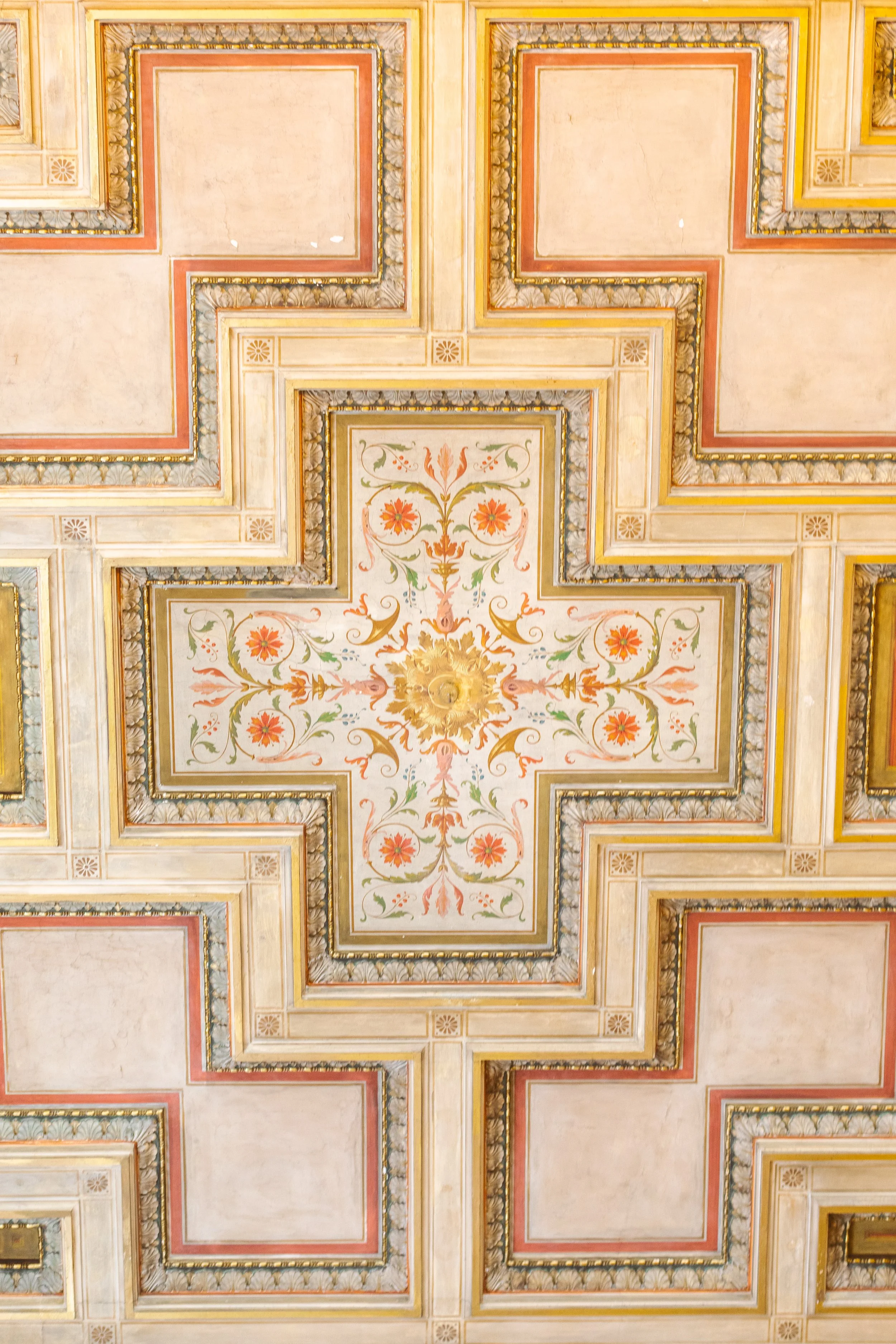
Most of my color palettes come from travel, architecture, food packaging, transit systems, weather, textiles, and accidental combinations found while walking.
Some of my favorite places to study color relationships:
fish markets
hotel lobbies
old signage
tiled interiors
public transportation
fruit stands
foggy streets
faded packaging
temple surfaces
coastal debris
cafe interiors
I rarely search for “perfect” color. I look for emotional tension:
warmth against concrete
softness against structure
oxidation against brightness
muted environments interrupted by electricity
Over time, these collected fragments become reference points for branding shoots, editorial portraits, commercial campaigns, and fine art projects alike.
With so much love,
Suzanne
Topics Discussed
branding photography, visual identity, color theory, travel photography, editorial photography, emotional branding, visual storytelling, creative direction, world-building, color palettes, artistic process, photography inspiration